
데이터 분석에 자주 사용하는 문법PYTHON/데이터분석2023. 9. 15. 17:15
Table of Contents
import pandas as pd
import numpy as np
import matplotlib.pyplot as plt
#행렬
import numpy as np
a = np.array([[1,2],[2,3]])
b = np.array([[5],[8]])
b
ar = np.linalg.inv(a) #역행렬
ar
answer = ar@b #행렬곱
answer

"""
array([[-3.,  2.],
       [ 2., -1.]])
"""
#통계
heights=np.random.normal(174,10,size=10000)
hs = pd.Series(heights) #키값
hs.value_counts()

"""
152.117446    1
181.541264    1
178.986252    1
163.160685    1
184.676618    1
             ..
166.797686    1
179.032540    1
173.568665    1
181.301275    1
174.842780    1
Length: 10000, dtype: int64

"""
데이터프레임의 height를 가져와서 히스토그램으로 시각화
import matplotlib.pyplot as plt
plt.hist(heights , bins = 100) #구간 100
plt.show()
#확률
1-6까지 쓰여진 육면체의 주사위가 있다. (공평하지 않은 주사위)
1이 나온 확률이 1/6
2이 나온 확률이 1/12
3이 나온 확률이 1/12
4이 나온 확률이 1/3
5이 나온 확률이 1/6
6이 나온 확률이 1/6
주사위를 100번 던지는 실험을 해보세요
0-11 사이의 랜덤한 수를 발생시킨다.
발생한 수가 0,1 이면 주사위 1
발생한 수가 2 이면 주사위 2
발생한 수가 3 이면 주사위 3
발생한 수가 4,5,6,7 이면 주사위 4
발생한 수가 8,9 이면 주사위 5
발생한 수가 10,11 이면 주사위 6
data = np.random.randint(0,12,1000)
cnts = np.zeros(6)

for tv in data:
  if tv == 0 or tv ==1:
    cnts[0] += 1
  elif tv == 2:
    cnts[1] += 1
  elif tv == 3:
    cnts[2] += 1
  elif tv>4 and tv<=7:
    cnts[3] += 1
  elif tv == 8 or tv == 9:
    cnts[4] += 1
  else:
    cnts[5] += 1
cnts

"""
array([170.,  91.,  68., 256., 168., 247.])

"""
#선형회귀
종속 변수 y와 한 개 이상의 독립 변수 (또는 설명 변수) X와의 선형 상관 관계를 모델링하는 회귀분석
ex) 하루에 걷는 횟수를 늘릴 수록, 몸무게는 줄어든다.
이러한 데이터를 가장 잘 설명할 수 있는 선을 찾아 분석하는 방법
temperature = [25.2, 27.4, 22.9, 26.2, 29.5, 33.1, 30.4, 36.1, 34.3, 29.1]
sales = [236500, 357500, 203500, 365200, 446600, 574200, 453200, 675400, 598400, 463100]

#데이터 넣기
dict_data = {"temp": temperature, "sale": sales}
df_sales=pd.DataFrame(dict_data, columns=["temp", "sale"])

dict_data

df_sales.plot.scatter(x='temp', y='sale',grid=True, title="temp and sale") #산점도
plt.show() #시각화
sales2 = np.array(sales)/10000
dict_data2 = {"temp": temperature, "sale2": sales2}
df_sales2=pd.DataFrame(dict_data2, columns=["temp", "sale2"])

plt.figure(figsize=(6,6)) #가로세로크기

plt.plot(temperature, sales2, 'o')
plt.xlim(0,80)
plt.ylim(0,80)
plt.show()
y = ax + b
y =wx + b : 머신러닝에서 표현하는 방식
w: 가중치 - 독립변수 x 가 종속 변수 y 에 영향을 주는 정도
b : 편향 - 주어진 인자 외에 결과 y 에 영향을 주는 정도
y = 3x - 5
y = 4x - 2
y = 5x - 3
y = 4x - 5
sales2 = np.array(sales)/10000
dict_data2 = {"temp": temperature, "sale2": sales2}
df_sales2=pd.DataFrame(dict_data2, columns=["temp", "sale2"])
plt.figure(figsize=(6,6))

plt.plot(temperature, sales2, 'o') #0으로 표현된것

plt.plot([0,80], [3*0-5, 3*80-5], '-', label='y=3x-5')
plt.plot([0,80], [4*0-2, 4*80-2], '-', label='y=4x-2')
plt.plot([0,80], [5*0-3, 5*80-3], '-', label='y=5x-3')
plt.plot([0,80], [4*0-5, 4*80-5], '-', label='y=4x-5')
plt.plot([0,80], [2*0-105, 3*80-105], '-', label='y=3x-105')
plt.plot([0,80], [3.4*0-55, 3.4*80-55], '-', label='y=3.4x-55')
plt.xlim(0,80)
plt.ylim(0,80)

plt.legend() #범례
plt.show()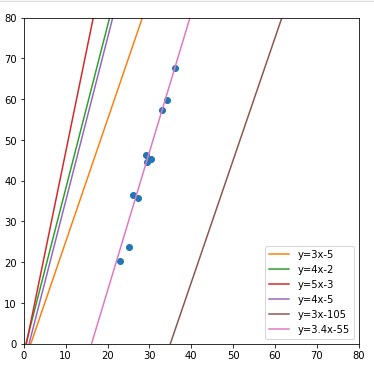
'PYTHON > 데이터분석' 카테고리의 다른 글
| 통계 데이터 분석 -확률 (0) | 2023.09.15 |
|---|---|
| 통계 데이터 분석 -선형회귀 (0) | 2023.09.15 |
| 통계분석시각화 - 통합 (1) | 2023.09.15 |
| 통계분석시각화 - 타이타닉2 (0) | 2023.09.15 |
| 통계분석시각화 - 타이타닉1 (0) | 2023.09.15 |


